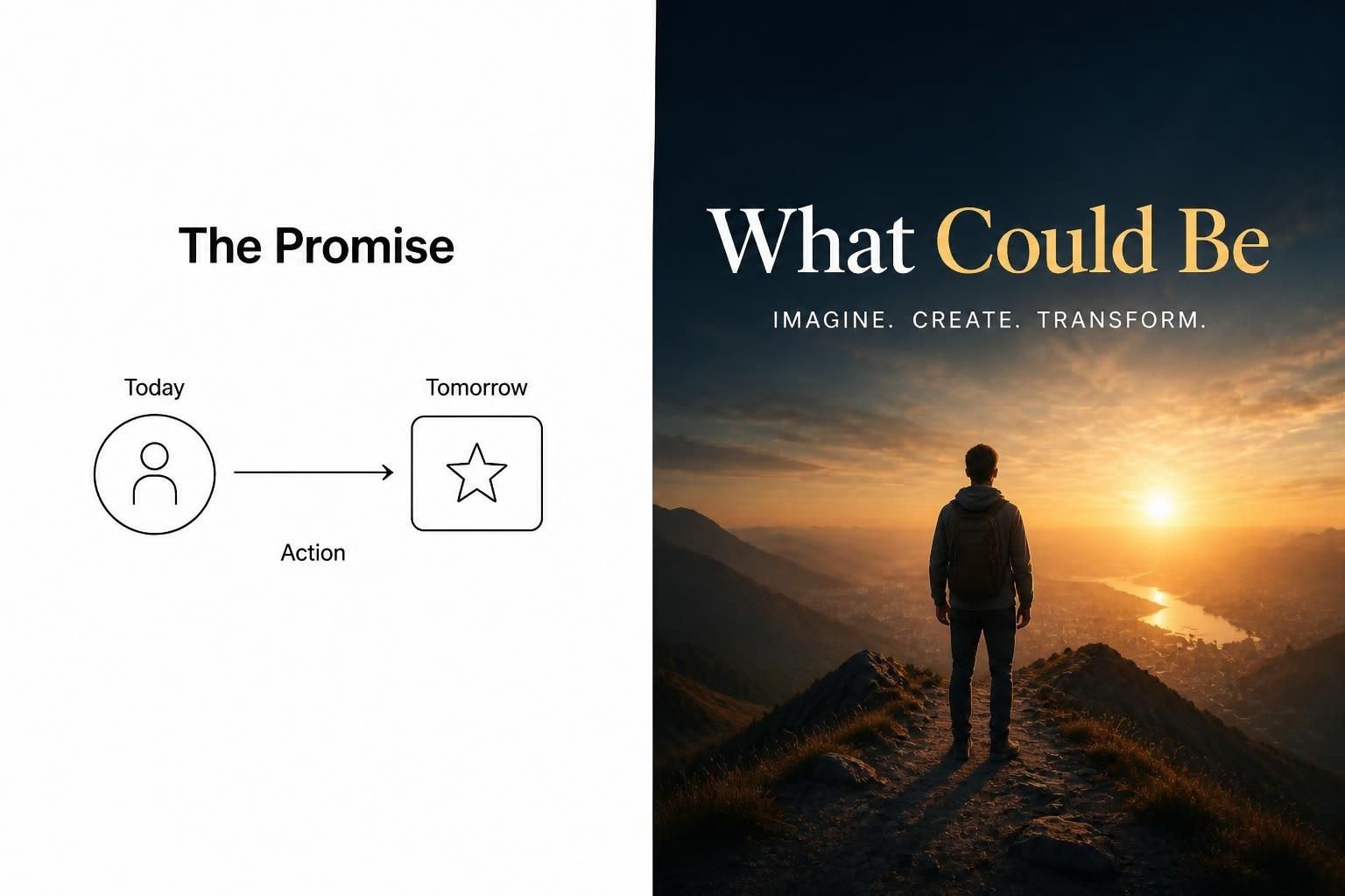
This blog post explores two highly effective presentation styles that will fundamentally change how you prepare your next slide deck. I have personally used both techniques during major project pitches, and the positive feedback was genuinely overwhelming.
You can download the updated version of this post as a PDF by clicking here
Presenting ideas effectively is a crucial skill for any professional working in today's fast-paced corporate environment. Many speakers struggle because they rely on bullet points instead of crafting a compelling narrative for their audience. By studying master communicators, we can learn to transform dry data into memorable experiences that drive real action. Patrick Winstons presentation style is best for teaching, job talks, and technical persuasion; Nancy Duarte is best for story-driven, audience-emotional presentations. For professional consulting work, the strongest styles after those two are the Pyramid Principle, MECE slide logic, SCQA, and executive-summary-first storytelling.
Presentation Styles: Patrick Winston vs Nancy Duarte
Patrick Winston’s style is direct: start with an empowerment promise, keep slides minimal, avoid slide crimes, and close with a contributions slide. His framework also stresses props, cycling key ideas, and getting the main vision across in the first five minutes for persuasive talks. Nancy Duarte’s style is different: it uses contrast between “what is” and “what could be,” and builds tension through a story arc that moves the audience toward action. In practical terms, Winston is more blunt and operator-friendly; Duarte is more narrative-led and emotionally shaped.
The Nancy Duarte Method for Presentation Styles
Nancy Duarte revolutionised corporate communication by introducing the concept of the sparkline structure for presentation styles. This framework constantly shifts the audience's attention between the flawed current reality and the brilliant future possibility. You begin by painting a vivid picture of the existing problem, making sure the pain points resonate deeply. Then, you introduce your solution as the ultimate reward, contrasting it sharply with the initial negative state. I vividly recall using this contrast method for a software rollout in Delhi, and the stakeholders immediately grasped the value proposition.
The Patrick Winston Approach to Presentation Styles
Professor Patrick Winston developed his legendary lecture series to help students communicate complex technical ideas with clarity. His methodology dictates that every good example of presentation styles must start with an explicit promise of what the audience will learn. Instead of relying on flashy graphics, he emphasised the use of a chalkboard or highly simplified slides to maintain focus. Furthermore, he insisted on cycling through core concepts multiple times to ensure maximum retention among the listeners. Applying his rule of avoiding laser pointers forced me to build better visual cues directly into my presentation slides.

Popular consulting styles
From a consulting point of view, these four styles are the most useful and widely respected: Pyramid Principle, executive-summary-first, SCQA, and issue-tree/MECE logic. They help busy leaders understand the answer fast, then the reasons, then the evidence.
-
Pyramid Principle. Start with the answer, then support it with grouped reasons and data. This is the default style for strategy decks and leadership updates.
-
Executive-summary-first. Put the conclusion, recommendation, or decision upfront, so executives do not wait for the punchline.
-
SCQA. Situation, Complication, Question, Answer; useful when you want a crisp business problem-to-solution flow.
-
MECE / issue-tree logic. Break the problem into mutually exclusive, collectively exhaustive parts so the analysis feels complete and non-overlapping.
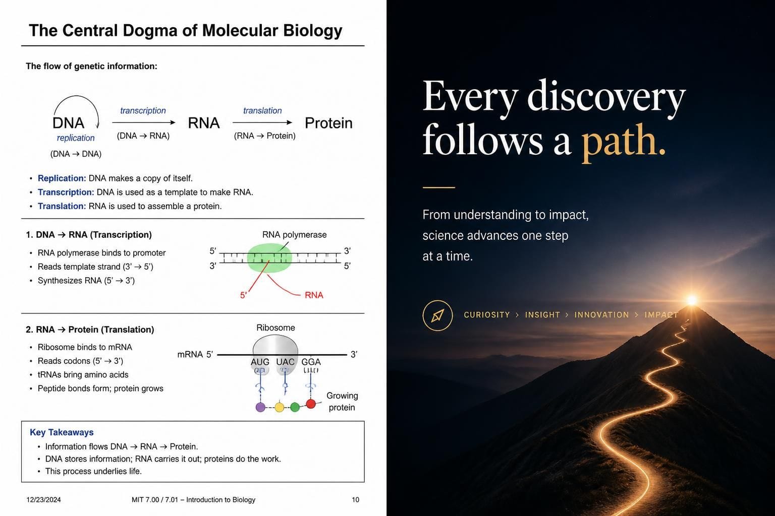
Note: In all images including feature image, the image on the left represents Patrick Winston's presentation style, the image on the right represents Nancy Duarte's presentation style.
Best use cases
If you are presenting to clients, investors, or senior leadership, the consulting styles usually outperform pure storytelling because they reduce cognitive load. If you are trying to change minds, launch a vision, or motivate action, Duarte’s contrast-driven arc is stronger. For teaching, technical talks, and high-stakes job talks, Winston usually wins.
Prompt templates
Below is the Duarte-version rewrite of your Patrick Winston prompts. I have kept the intent the same, but shifted the language from “empowerment promise / slide crimes / contributions slide” to “contrast / tension / call to action / story arc”.
1. Start any presentation right
Template: “Act as a presentation coach using Nancy Duarte’s presentation framework, where every great talk starts by clearly defining the gap between what is and what could be, then building a story arc that moves the audience from tension to resolution. Start by asking for the presentation topic, audience, and desired change, then identify the audience’s current pain point and the desired future state. Craft an opening that contrasts these two states, establishes urgency, and shows why the message matters now. Remove filler, weak jokes, and unnecessary context, and instead focus on a compelling opening that makes the audience feel the gap and want to close it. The final output should include a strong opening hook, a clear ‘what is vs what could be’ contrast, and a polished opening script that leads naturally into the talk.”
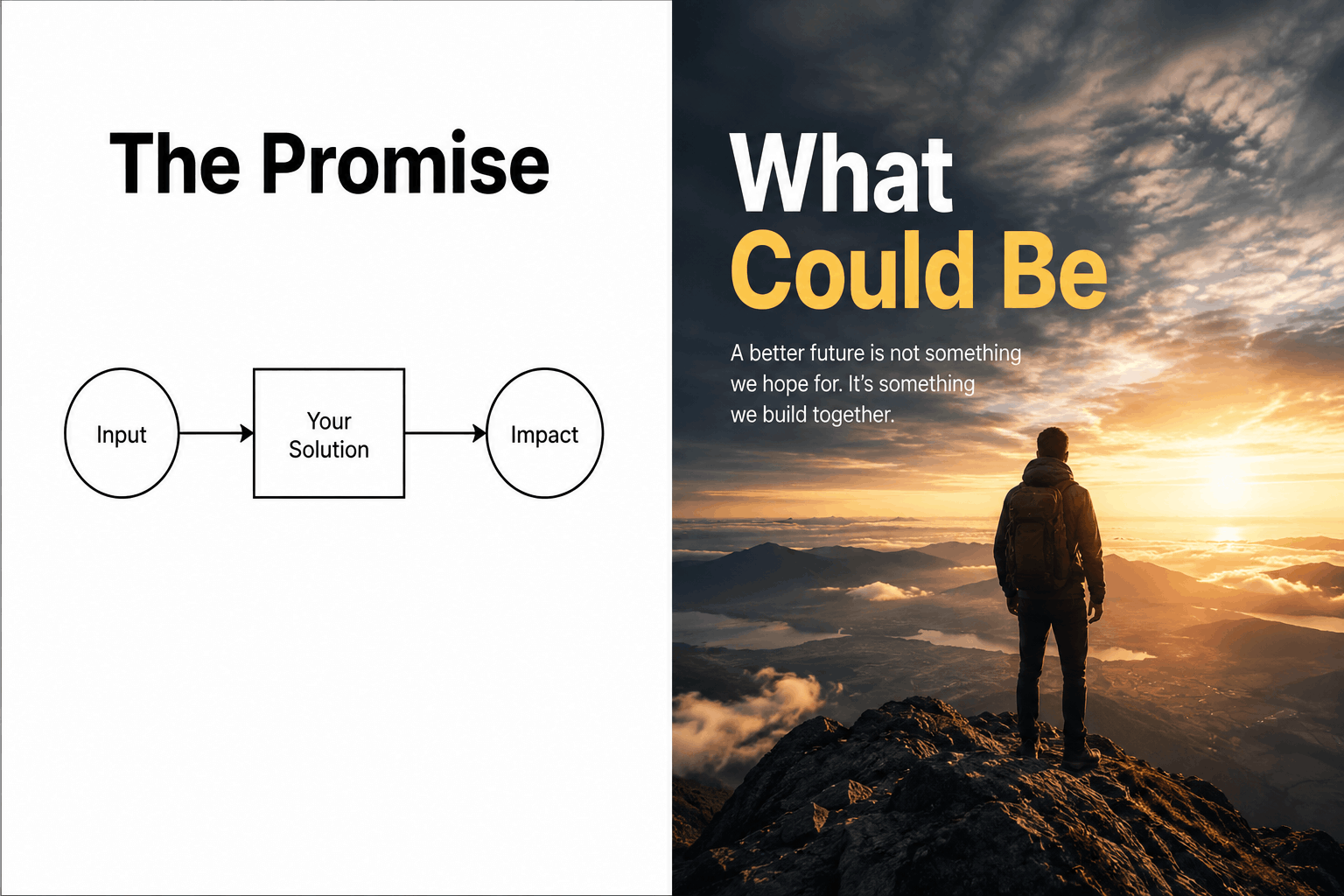
2. Eliminate your slide crimes
Template: “Act as a presentation design critic using Nancy Duarte’s principles to identify and remove anything that weakens clarity, emotional pull, or visual rhythm. Start by reviewing or having me describe my slides, then audit them for clutter, weak visual hierarchy, text-heavy layouts, inconsistent contrast, poor image choices, and any slide that fails to advance the story. For every issue found, provide a precise fix that improves clarity and supports the narrative flow from struggle to resolution. Redesign the final slide so it reinforces the call to action or next step, rather than ending with a generic thank you. Focus on creating visual contrast, breathing room, and story momentum. The final output should include a clear audit, specific fixes, a redesigned ending slide, and a brief on what to keep, remove, and improve.”
3. Make your ideas unforgettable
Template: “Act as a message architect using Nancy Duarte’s storytelling framework to turn any idea into a presentation people remember and act on. Start by asking for the core idea, target audience, and the transformation you want them to experience, then define the tension between the current reality and the desired future. Build the idea into a story arc with contrast, emotional stakes, and a clear resolution. Use vivid language, memorable phrasing, and proof points that make the message feel both credible and human. The final output should present a cohesive narrative with current state, future state, tension, resolution, and a compelling call to action.”
4. Structure any talk that persuades
Template: “Act as a persuasion architect using Nancy Duarte’s presentation structure to design a talk that moves an audience from awareness to action. Start by asking for the presentation goal, audience, and desired action, then craft a narrative that contrasts the current problem with the future opportunity. Build the middle of the talk around repeated tension-and-release patterns that keep the audience engaged, and support the story with evidence, examples, and proof of progress. End with a clear call to action that shows the audience the next step and why it matters. Ensure every part of the talk either deepens the problem, expands the vision, or advances the resolution. The final output should include a sharp opening contrast, a persuasive story arc, and a strong closing action statement.”
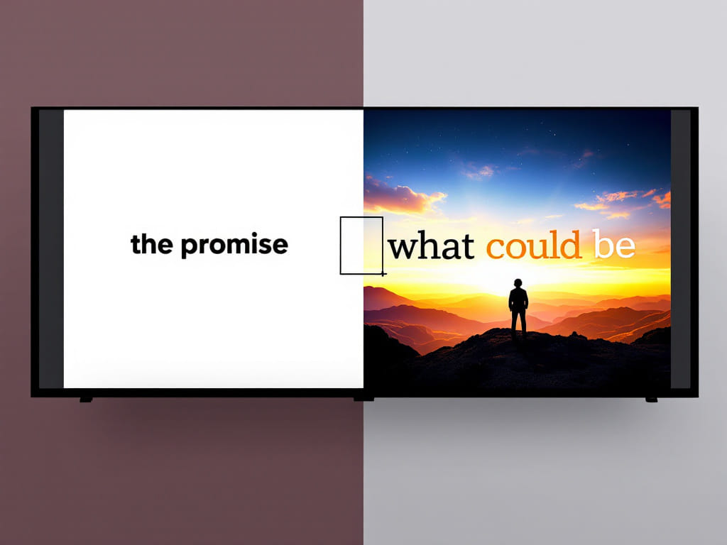
5. Use props and stories to teach anything
Template: “Act as a teaching design specialist using Nancy Duarte’s storytelling approach to make complex ideas concrete and memorable. Start by asking for the concept and audience, then identify the main point of confusion and the emotional friction around it. Design a story, metaphor, demo, or visual contrast that helps the audience move from confusion to clarity. Build the teaching sequence around problem, struggle, insight, and resolution so the lesson feels like a journey. Ensure the explanation uses vivid examples, simple language, and a clear transformation the audience can see and remember. The final output should include the confusing concept, story arc, teaching sequence, and a clear resolution that makes the idea stick.”
6. End any presentation powerfully
Template: “Act as a presentation closing specialist using Nancy Duarte’s framework to deliver endings that resolve the tension and leave the audience with a clear next step. Start by asking for the topic, audience, and desired call to action, then create a closing that mirrors the opening contrast and shows how the gap has been closed or what remains to be done. Craft words that energize the audience and point them toward action, rather than using filler or a generic thank you. Eliminate weak endings and ensure the final moments feel like a satisfying resolution to the story you told. The final output should include a precise closing slide, impactful final words, clear elements to avoid, and a tightly structured closing script that lands with authority.”
References
- Patrick Winston transcript
- Nancy Duarte interview
- Pyramid Principle overview
- consulting slide structure examples
- ocw.mit
- juliemasters- nancy- duarte presentations
- slideworks
- slideshare
Note: AI Image Prompt generation
A landscape, split-screen image comparing two distinct presentation slide styles side-by-side. The left half shows a Patrick Winston style slide: ultra-minimalist, stark white background, a single bold black heading that reads "The Promise", a very simple line-drawn diagram, and zero decorative clutter. The right half shows a Nancy Duarte style slide: cinematic and emotionally engaging, featuring a high-quality, dramatic background image of a person looking toward a bright horizon, with bold, contrasting typography that reads "What Could Be". The line dividing the two halves is sharp and clean, creating a high-resolution, professional presentation aesthetic. Visual Breakdown-
Winston's Side (Left): Focuses entirely on cognitive clarity and technical persuasion. It strips away all distracting elements and backgrounds to highlight a single mechanism or empowerment promise, representing his strict rule against presentation clutter.
-
Duarte's Side (Right): Focuses heavily on emotional resonance and narrative tension. It relies on a powerful visual metaphor and high contrast to immediately establish the emotional gap between the current state and the desired future state.